
TLDR — 10 Trust Fixes That Move Website Conversion
- Most growth-stage websites don’t have a traffic problem — they have a trust problem that bleeds every channel.
- Start every audit by comparing your CVR to category benchmarks, then rule out traffic quality as the culprit.
- Audit in this order: hero clarity → CTA consistency → page speed → social proof proximity.
- If your headline fits on a competitor’s site without changing a word, it’s not working.
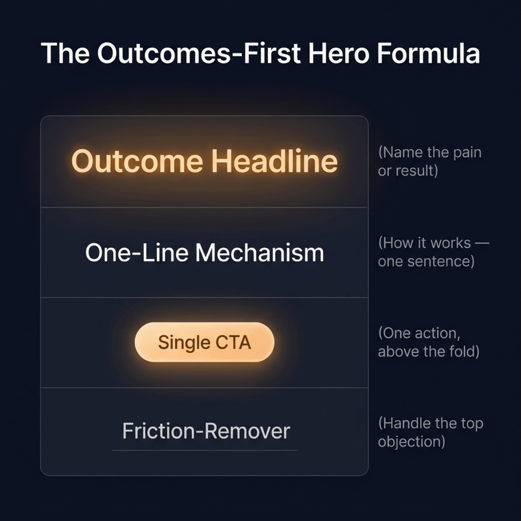
- Hero formula: outcome headline, one-line mechanism, single CTA, friction-remover.
- Relevant case studies outperform prestigious logos every time — sector and problem match is what converts.
- Gate only what requires security — ungate everything else to build trust, not block it.
- For self-serve products, hiding pricing behind “Contact Us” is a conversion killer.
- In 30 days, fix copy clarity first, CTA strategy second, then page speed or pricing transparency — deprioritize everything else.
- Track CVR in days, lead quality in weeks, CAC in months — don’t wait for lagging indicators to validate leading ones.
- Want to find where you’re leaking trust? Reach out to MAVAN.
The Friction You Can’t See
Eight steps. That’s how many it took for a new user to go from landing on a consumer product’s website to actually using the thing they came for. MAVAN Growth Lead Matt Saunders worked on that funnel — and when he mapped it end to end, the bloat was obvious. Some steps existed for security. Others captured behavioral data. A few had simply accumulated as the product scaled, added by different teams at different times, without anyone stepping back to look at the full picture.
No single step was unreasonable on its own. That was the problem. Each one felt justified in isolation — a compliance requirement here, a data need there, a UX shortcut that made sense at the time. But stacked together, they asked users to repeat themselves, jump through hoops, and prove their patience before they’d seen a single moment of value. When the team stripped the journey to its essentials — with distinct flows for new and existing users, both laser-focused on getting people into the product fast — conversion jumped 15% for existing users and 30% for new ones. The impact on CAC, long-term ROAS, and user sentiment was material and immediate.
Saunders’ experience captures something we see constantly in our work with growth-stage companies. The friction that kills conversion is rarely one bad decision. It’s the accumulation of many small, reasonable decisions that nobody has audited as a complete journey. And the website — the single highest-leverage touchpoint in most acquisition funnels — is where that pattern shows up first.
Your Website Probably Doesn’t Have a Traffic Problem
There is often a misconception in growth that the path to better numbers runs through more traffic. More ad spend, impressions, and top-of-funnel volume. It’s the default playbook for growth-stage teams under pressure — and it’s almost always the wrong first move.
We work with founders, Heads of Growth, and first marketing leaders at post-PMF, venture-backed companies. The mandate is always some version of the same thing: improve CAC, lift conversion, and build pipeline — fast, and without a dozen new hires to do it. And what we find, almost without exception, is that the website already gets enough traffic to hit those targets. The problem is what happens after someone arrives.
The numbers back this up. According to First Page Sage’s B2B conversion data, the average B2B SaaS company converts roughly 1.5% of website visitors into leads. SaaS Hero’s 2026 benchmark analysis puts the top 10% at 8–15% — from the same types of traffic, in the same categories. That gap doesn’t come from buying better clicks. It comes from what visitors experience when they land.
That experience — and whether it builds confidence or erodes it — is what we mean when we talk about trust.
Not trust in the abstract, “brand affinity” sense. Trust in the operational sense: does this website make me believe this company can solve my problem, and does it make the next step feel easy and safe? When the answer is no, even the best-performing ad campaigns bleed money into a leaking bucket. Every dollar spent driving traffic to a site that confuses, frustrates, or fails to convince is a dollar partially wasted.
And the leak is rarely just one thing. It’s not just design, SEO, or copy. It’s a combined credibility, clarity, and friction problem — spanning messaging, UX, technical performance, proof, and CTA structure — that quietly suppresses conversion across every channel feeding the site. Your paid campaigns underperform. Your LinkedIn content generates clicks that don’t convert. Your organic traffic bounces. The instinct is to blame the channels. But the channels aren’t the problem. The website is.
This is where growth-stage teams have a genuine structural advantage, if they choose to use it. Unlike enterprise companies drowning in stakeholders and approval chains, a growth-stage team can audit, prioritize, and fix these issues in weeks — not quarters. The ROI is fast, the effort is finite, and the impact compounds across every acquisition channel simultaneously.
The rest of this article is a practical guide to doing exactly that.
We’ll walk through how to diagnose whether your website has a trust problem, which fixes move the numbers fastest, and how to sequence 90 days of work so that each improvement builds on the last. All drawn from real audits, real results, and the diagnostic frameworks our team uses every day — starting with the one our Growth Lead Matt Saunders walks through first whenever he opens a new engagement.
Diagnose Before You Prescribe: A Framework You Can Steal
The most expensive mistake a growth-stage team can make with their website isn’t choosing the wrong fix. It’s skipping the diagnosis entirely and jumping straight to solutions. We see it constantly — a founder reads an article about hero copy, rewrites the headline, and wonders why nothing changed. A Head of Growth sees a slow page speed score, throws engineering resources at it, and watches conversion stay flat. The fix wasn’t wrong. It was just aimed at the wrong problem.
Matt Saunders runs the same diagnostic sequence at the start of every MAVAN engagement, and the order matters. Here’s how it works — and how you can run it yourself this week.
Start With the Headline Number
Pull your conversion rate to the primary action on the site — demo request, free trial signup, contact form, whatever your core conversion event is. Then compare it to what a strong site in your category should produce. For B2B SaaS, First Page Sage’s industry data puts the average visitor-to-lead conversion around 1.5–3%, depending on the vertical. If you’re well below that floor, you have a confirmed problem. If you’re at or near it but still missing pipeline targets, the issue might be further down the funnel — or it might be traffic quality masquerading as a website problem.
That distinction is critical. “Look at how your CVR has changed over time as your traffic mix has shifted,” Saunders says. “Sometimes what looks like a conversion problem is actually a traffic quality problem in disguise.” If conversion dropped right when you scaled a new paid channel or shifted your content strategy, the website might not be the culprit. But if conversion is consistently underperforming across multiple traffic sources — paid, organic, direct, referral — the site itself is the bottleneck.
Then Audit in This Order
Once you’ve confirmed the website is the issue, Saunders works through four checkpoints — in sequence, because each one builds on the last.
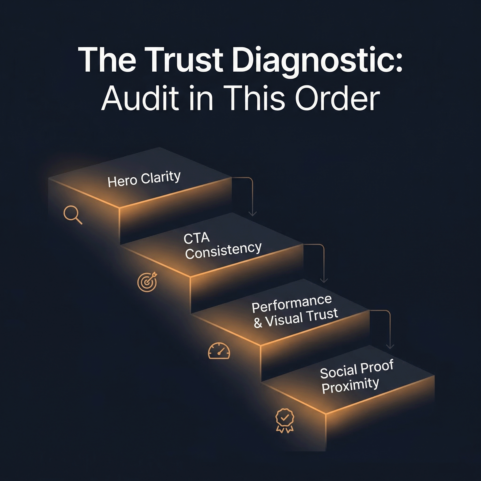
Hero clarity. Can a first-time visitor understand what your company does and who it’s for within five seconds of landing — without scrolling? Test this on both mobile and desktop. If there’s any ambiguity, nothing downstream matters yet. A fast page with a confusing hero is still a leaking page.
CTA consistency. Is there one clear, consistent call to action above the fold — or are there competing asks pulling the visitor in different directions? “A mismatched banner CTA versus hero CTA is a very common and very fixable leak,” Saunders notes. This is one of the fastest wins available, because consolidating competing CTAs into a single clear next step often produces immediate conversion lift with minimal effort.
Performance and visual trust. Slow load times and aggressive cookie popups erode trust before a visitor has read a single word. This is especially damaging on mobile, where most traffic arrives but formatting is most often broken. According to Portent’s site speed research, a B2B site that loads in one second converts at 3x the rate of a site that loads in five seconds — and 5x the rate of a site that takes ten. Yottaa’s 2025 Web Performance Index, which analyzed over 500 million visits across 1,300 e-commerce sites, found that 63% of visitors bounce from pages that take more than four seconds to load. Speed isn’t a nice-to-have. It’s a trust signal — and one of the few that affects every single visitor regardless of intent, channel, or buying stage.
Social proof proximity. Logos, case studies, and quantified outcomes should be visible without significant scrolling. “If someone has to hunt for proof, most won’t,” Saunders says. This doesn’t mean cramming a logo wall above the fold. It means placing the right proof — relevant to the visitor’s context — early enough in the page to reinforce the hero’s promise before doubt sets in.
Why the Order Matters
This sequence isn’t arbitrary. Each checkpoint answers a prerequisite question for the next. If the visitor doesn’t understand what you do (hero clarity), it doesn’t matter how clean your CTA is. If the CTA is clear but the page takes six seconds to load (performance), the visitor never reaches it. And if the page is fast and the CTA is obvious but there’s no proof backing up the claim (social proof proximity), the visitor understands what you’re asking — they just don’t believe you enough to do it.
Think of it as a trust ladder. Each rung has to hold before the next one bears weight. When teams skip rungs — or try to fix rung four while rung one is broken — they burn time and budget without moving the number that matters.
The Five Biggest Trust Leaks on Growth-Stage Websites
The diagnostic framework tells you where to look. This section tells you what you’ll probably find when you get there. These are the patterns our team sees repeat across growth-stage sites in nearly every engagement. Each one bleeds conversion, and most have been sitting in plain sight for months.
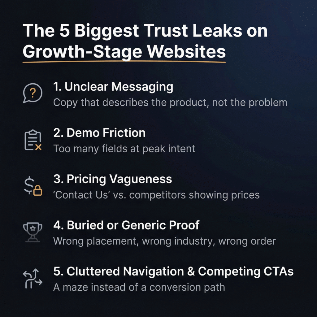
1. Copy That Describes the Product Instead of the Problem It Solves
This is the most common trust leak we encounter, and it’s the most damaging — because everything else on the page is downstream of whether the visitor understands your value in the first few seconds. The issue isn’t vague copy in the generic sense. It’s copy that leads with what the product is rather than what the product does for the buyer.
“Visitors shouldn’t have to work out what problem you solve,” Saunders says. “If they do, they leave.”
Growth-stage companies are especially prone to this because the people writing the copy are usually closest to the product. They default to internal language, feature descriptions, and category labels that mean something inside the building but land as noise to a first-time visitor evaluating four tabs at once. When your hero reads like a product spec sheet — or worse, like a string of adjectives (“powerful,” “seamless,” “intelligent”) — you’ve asked the visitor to do translation work that most simply won’t do. They’ll close the tab and click the next search result instead.
2. Demo Flows That Kill Momentum at Peak Intent
A visitor who clicks “Request a Demo” has just made the highest-intent action your website can produce. They’ve decided — in that moment — that your product is worth their time. And then the experience hands them a form with eight fields, a vague confirmation screen, and a promise that “someone from our team will be in touch.”
That gap between intent and experience is where conversion dies. “There’s a balance to strike — yes, you want enough information to qualify and inform marketing,” Saunders says. “But the rule of thumb is as few steps as possible to get the visitor to the action. Every unnecessary field is a drop-off risk.”
The data supports this at scale. According to Cobloom’s landing page research, pages with five or fewer form fields convert 120% better than those with more. And the damage isn’t just mathematical — it’s psychological. A bloated form at the moment of highest intent signals that the company values its own data needs over the buyer’s time. That’s a trust problem, not a UX problem.
3. Pricing That’s Impossible to Find — or Impossible to Understand
This one depends on your business model, but the default instinct at most growth-stage companies is to hide pricing behind a “Contact Us” wall. For higher-ACV, genuinely bespoke deals, that can be defensible. For lower-ACV or self-serve products, it’s a conversion killer.
“Buyers at that tier expect transparency,” Saunders says. “If a competitor one click away shows their pricing and you don’t, you’ve already lost.”
The underlying issue is that pricing vagueness doesn’t just create friction — it signals uncertainty. When a post-PMF company with existing customers and a scaling product still can’t clearly communicate what it costs, buyers read that as a business problem, not a website design choice. We’ll dig into the full pricing transparency framework in a later section, but for now, the diagnostic question is simple: can a visitor find and understand your pricing without asking a human? If not — and you’re not selling six-figure enterprise contracts — this is likely suppressing conversion right now.
4. Proof That’s Buried, Generic, or Both
Most growth-stage websites have social proof somewhere. The problem is usually placement, relevance, or both. A logo wall buried below three screens of scrolling won’t do the work it needs to do. Neither will a glowing testimonial from a customer in an industry completely unrelated to the visitor’s.
“Logos and case studies buried below the fold won’t do the work you need them to,” Saunders says. “But placement isn’t the only issue — relevance matters just as much. If I’m in healthcare, I want to see proof from healthcare.”
This is where growth-stage companies often underestimate the sophistication of their buyers. A B2B buyer evaluating your product isn’t just asking does this work? They’re asking does this work for someone like me? Generic proof answers the first question — barely. Relevant proof answers both. One practical fix Saunders recommends: industry or use-case selectors on landing pages that let the proof speak directly to the visitor’s context. It’s a small structural change with disproportionate conversion impact, because it transforms passive proof into targeted reassurance.
5. Cluttered Navigation and Competing CTAs
A landing page should do one thing well: move the visitor toward a single clear action. The moment you introduce five navigation options, a banner CTA, a hero CTA, a sidebar CTA, and a footer CTA — all pointing in different directions — you’ve turned a conversion path into a maze.
“The moment you give someone five menu options and three different CTAs, you’ve created a rabbit warren instead of a conversion path,” Saunders says.
This leak is particularly insidious because it often gets worse as the company grows. New campaigns get new banners. New features get new menu items. New stakeholders request new CTAs on the homepage. Each addition is small and feels reasonable — just like the eight-step funnel from our opening story. But the cumulative effect is a page that asks the visitor to make too many decisions before they’ve made the one decision you actually need from them. SaaS Hero’s 2026 CRO framework highlights this directly: removing navigation menus and secondary CTAs from key landing pages can double conversion rates by keeping visitors focused on a single action.
The Pattern Underneath All Five
Notice what these leaks have in common. None of them are dramatic. None of them look like emergencies in isolation. A slightly unclear headline. A form with a few extra fields. Pricing that’s one click too far away. Proof that’s in the wrong order. A navigation bar that’s a little too full. Each one feels minor on its own — and that’s exactly why they survive for months without anyone fixing them. The damage is cumulative and compounding — without raising any alarm bells. Which is also why, when you fix them in sequence, the improvement compounds just as fast.
What Strong Above-the-Fold Trust Actually Looks Like
It’s easy to diagnose a broken hero section. It’s harder to know what a working one looks like — especially when most of the advice out there boils down to “make it clearer” without showing you what clarity actually means in practice. This section is the fix for that. We’re going to break down what effective above-the-fold trust looks like, how to test whether yours is working, and the specific formula our team uses to rewrite hero copy that converts.
The Five-Second Test
Before you touch a single word of copy, run this test. Open your homepage — on both mobile and desktop — as if you’ve never seen it before. Give yourself five seconds. Then answer two questions: Do I know what this company does? Do I know who it’s for?
If either answer is unclear, the hero isn’t working. It doesn’t matter how elegant the design is, how smooth the animation feels, or how much your team loves the tagline. If a first-time visitor can’t pass that five-second test, every dollar you’re spending to get them there is fighting uphill.
“We look at CTA click rate on the primary above-the-fold action versus CTAs further down the page,” Saunders says. “If the top CTA is underperforming, the hero isn’t building enough interest or clarity to motivate action.” That metric — the ratio between hero CTA clicks and lower-page CTA clicks — is one of the fastest ways to confirm whether the problem is above the fold or below it. If visitors are scrolling past your hero to engage further down, they’re telling you the first thing they saw didn’t give them enough reason to act.
The Outcomes-First Formula
Most hero copy gets the sequence backwards. It starts with what the product is — a platform, a tool, a solution — and then tries to work its way toward why the buyer should care. That’s the wrong order. Buyers don’t care what your product is until they believe it can solve their problem. The formula Saunders uses flips that sequence entirely:
Lead with the outcome. What does the customer get? Not what the product does — what changes in the buyer’s world because of it. This is the headline. It should name the pain or the result, not the product category.
Follow with a one-line explanation of how it works. This is the subheadline. One sentence. No jargon. Just enough mechanical clarity for the visitor to understand the basic mechanism without needing a demo.
Then one clear CTA. Not two. Not three. One action that matches the visitor’s intent level and feels proportional to the trust you’ve earned so far.
Then a friction-remover. This is the line that handles the most common objection at the exact point where the visitor is deciding whether to click. It sits directly beneath or beside the CTA, and its only job is to make the action feel safer.
What This Looks Like in Practice
Saunders points to nexus.mavan.com as an example of this formula executed cleanly.
The headline — “Stop Guessing Which Campaigns Work” — leads with the pain and the outcome, not the product. It doesn’t say “marketing analytics dashboard” or “cross-channel attribution platform.” It names the thing the buyer is actually frustrated by.
The subheadline — “Real-time ROAS across Meta, Google, TikTok, and LinkedIn — no spreadsheets, same-day insights” — delivers the mechanism in one line. It tells the visitor how the product solves the problem the headline just named, using specific language (channel names, “same-day”) instead of abstract claims.
The CTA — “Start Free Trial” — is a single, unambiguous action. No competing buttons. No “Learn More” sitting next to “Book a Demo” sitting next to “Watch Video.” One ask.
And the friction-remover — “No credit card · 14-day trial · Live in 5 minutes” — handles the three objections most likely to stop someone at that exact moment: Will this cost me money before I’m ready? How long do I have to evaluate it? How much setup pain is involved? Each objection gets a direct, specific answer in fewer than ten words total.
That’s the formula. Outcome, mechanism, action, reassurance — in that order. It works because it mirrors the buyer’s actual decision sequence rather than the company’s internal narrative about its own product.
Why Most Hero Copy Fails
The failure mode Saunders sees most often is hero copy that leads with adjectives — “powerful,” “seamless,” “intelligent,” “next-generation” — or with a product category label that means nothing to a buyer who hasn’t already decided they need that category.
“If your hero could apply to any company in your space, it isn’t working hard enough,” Saunders says.
This is worth sitting with for a moment. Open your homepage right now and read your headline. Then mentally paste it onto your two closest competitors’ sites. If it fits just as well on theirs as it does on yours — if swapping the logo is the only thing that would need to change — the copy isn’t doing its job. It’s describing a category, not making a case. And in a market where buyers are evaluating multiple options simultaneously (often in adjacent browser tabs), a headline that could belong to anyone effectively belongs to no one.
The fix isn’t to be clever. It’s to be specific. Name the outcome your buyer wants. Name the pain they’re escaping. Use the language they actually use to describe that pain — which is almost never the same language your product team uses internally. That specificity is what makes a headline feel like it was written for the visitor, not about the product. And that feeling — the sense that this company understands my problem — is the first and most important trust signal on the page.
Which Trust Signals Actually Move Conversion — and Which Are Cosmetic
Every growth-stage website has some version of trust signals on the page. Logos. Testimonials. A “Trusted by” banner. Maybe a security badge or two. The problem isn’t usually the absence of trust signals — it’s the assumption that their mere presence is doing the work. It isn’t. Placement, relevance, and sequencing determine whether a trust signal builds buyer confidence or fades into visual wallpaper. And the hierarchy between different types of signals is far less intuitive than most teams assume.
Saunders ranks trust signals by their actual conversion impact — not by how common they are or how good they look on the page. The gap between what companies prioritize and what actually moves buyers is one of the most consistent findings in our audits.
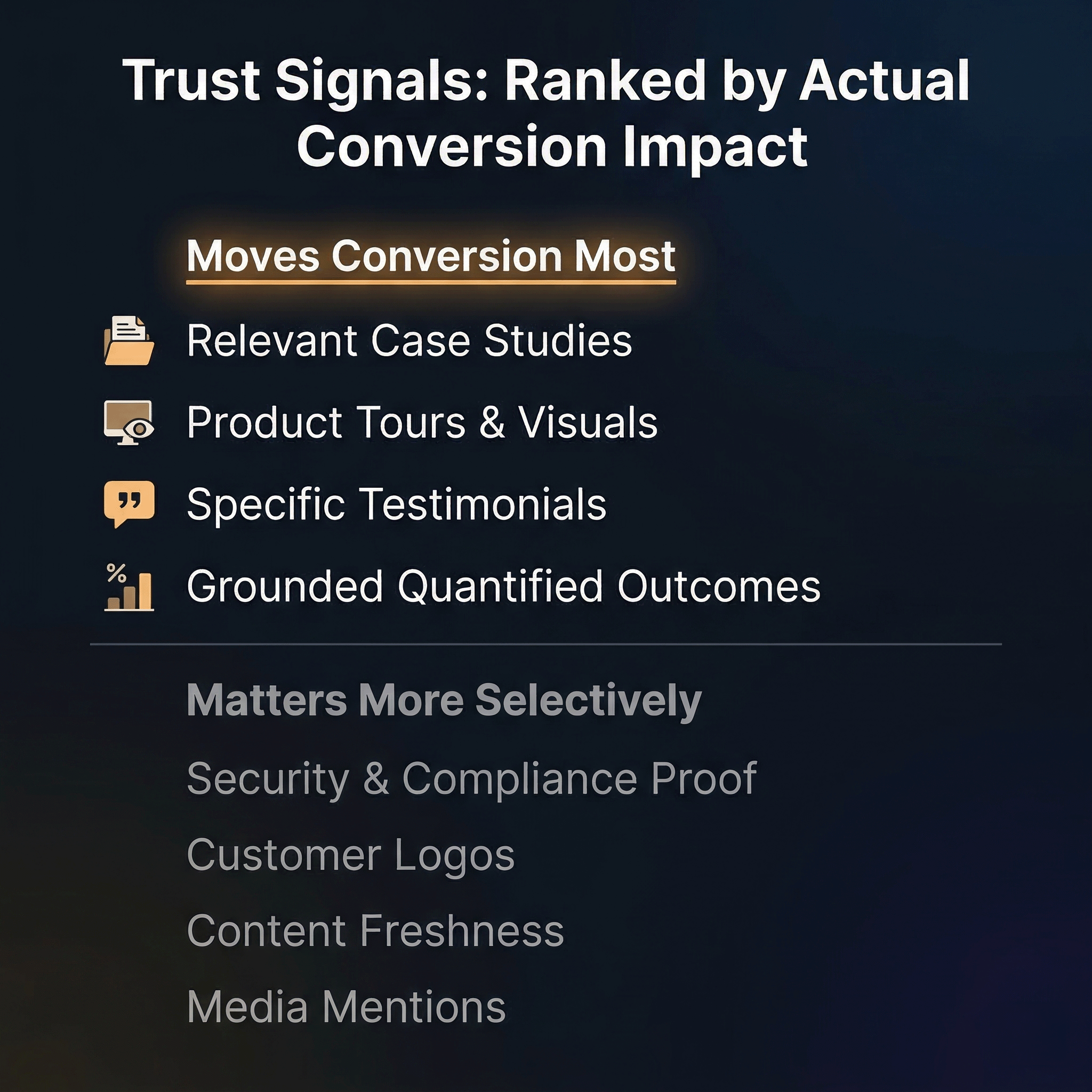
Signals That Tend to Move Conversion Most
Relevant case studies. This is the single most effective trust signal for growth-stage companies, and the key word is relevant. “Relevance beats prestige every time,” Saunders says. “A case study from a mid-size company in the visitor’s sector, solving the visitor’s specific problem, will outperform a logo from a Fortune 500 that operates in a completely different context.” The filter that matters most is sector and problem match — not brand recognition, not company size, not how impressive the logo looks on the page. A healthcare buyer wants to see a healthcare case study. A fintech buyer wants proof from fintech. The more precisely the case study mirrors the visitor’s situation, the better it works.
Product tours and visuals. Letting a buyer see the product before they commit is increasingly expected — and increasingly a differentiator. “This doesn’t have to mean a full interactive tour,” Saunders says. “But at the very least, clear, well-chosen product screenshots make a significant difference. The goal is to remove the friction of having to book a demo just to understand what you’re buying.” In a market where competitors are offering ungated product walkthroughs, hiding the product behind a form signals either that the product isn’t ready to be shown or that the company values lead capture over buyer confidence. Neither interpretation helps conversion.
Specific testimonials. Short, concrete quotes from customers in a relevant context outperform long, glowing endorsements from unrelated industries every time. A two-line quote from someone in the visitor’s sector, describing the specific problem your product solved, carries more weight than a paragraph of praise from a customer the visitor can’t relate to. Specificity — of problem, of industry, of outcome — is what separates a testimonial that builds trust from one that simply takes up space.
Quantified outcomes — but only when grounded. Numbers are powerful trust signals when they’re attributed and backed by real case studies. “Reduced CAC by 40% — [Company X]” lands well if it connects to proof the visitor can verify. The same claim without attribution lands nowhere. “Buyers see through unsubstantiated claims immediately,” Saunders says, “and vague outcome language actively damages trust.” This is a critical distinction. A specific, sourced number accelerates belief. A vague, unsourced number does the opposite — it makes the visitor wonder what else on the page isn’t quite real.
Signals That Matter More Selectively
Security and compliance proof. In regulated industries — fintech, healthcare, enterprise software — security certifications and compliance badges are table stakes. Their absence is a red flag that can disqualify you before the visitor reads a word of copy. But in other categories, these signals barely register. The diagnostic question is simple: does your buyer’s procurement or compliance team have a seat at the evaluation table? If yes, this is non-negotiable. If no, it’s low priority.
Customer logos. This is where the gap between perception and reality is widest. Logo walls are one of the most common trust elements on growth-stage websites — and one of the most consistently over-indexed. “A logo wall only builds trust if the visitor actually recognizes the names,” Saunders says. “Unknown logos do little.” A grid of twelve logos the visitor has never heard of doesn’t build credibility. It just fills space. More importantly, sequencing matters. Logos placed before the company has established what it does and why it matters are wasted. “Earn the right to show proof first,” Saunders says. Establish the problem, articulate the value, and then show that credible companies agree with you. That order makes the logos land. The reverse order makes them invisible.
Content freshness. This is an underrated trust signal that most teams overlook entirely. “If your news feed has articles from two years ago or your FAQ hasn’t been updated since launch, it signals to buyers that the company isn’t actively invested in its web presence — and by extension, possibly its customers,” Saunders says. A blog with nothing posted in eighteen months, a press page stuck in 2023, an FAQ that references a product version two iterations old — each one tells the visitor that nobody is minding the store. Keeping content recent won’t move conversion on its own. But stale content can erode the trust that everything else on the page is trying to build.
Media mentions. Helpful for credibility if the coverage is recent, specific, and from a publication the visitor respects. A current feature in an industry-relevant outlet can reinforce the case you’re making. But “As seen in TechCrunch” from three years ago does nothing — it’s a timestamp that works against you, not for you.
The Principle That Ties It All Together
There’s a through-line across this entire hierarchy: proof only works after the visitor understands what you do. The most relevant case study in the world won’t convert if the hero copy above it is confusing. The most specific testimonial won’t land if the visitor still isn’t sure whether the product is for them. Trust signals are amplifiers — they strengthen a message that’s already clear. They can’t replace one that isn’t.
This means the sequencing of trust signals on the page should mirror the buyer’s decision process. First, establish what you do and who it’s for (hero clarity). Then show that it works for people like them (relevant proof). Then make the next step feel easy and safe (CTA plus friction-remover). Every element in between should serve that sequence — and anything that doesn’t is either in the wrong place or on the page for the wrong reason.
Gating Is Probably Costing You More Than It’s Capturing
If there’s one instinct that unites growth-stage companies across every vertical, it’s the impulse to gate everything. Demos, product tours, case studies, walkthrough videos, screenshots of the core workflow — all locked behind a form in the name of lead capture. The logic feels airtight: if someone wants to see the product, they should give us their email first. That way we get a lead, the sales team gets a contact, and marketing gets a number to report.
The problem is that this logic optimizes for the company’s data needs, not the buyer’s decision process. And the conversion cost is almost always higher than the leads are worth.
When Gating Hurts
“The default instinct at most growth-stage companies is to gate everything in the name of lead capture,” Saunders says. “In most cases, that instinct is costing them conversion.”
The damage is most severe when the gated content is the very thing the buyer needs to build confidence. A product tour video that shows the core workflow. A set of screenshots that demonstrate what the interface actually looks like. A case study that proves the product works for someone in the buyer’s industry. These are trust-building assets — and putting a form in front of them interrupts the trust-building process at exactly the wrong moment. The visitor arrived with curiosity and some degree of intent. The gate converts that intent into a transaction — give me your information before I give you mine — and most buyers, especially in B2B where they’re evaluating multiple options simultaneously, will simply close the tab and visit the competitor who shows the product without asking first.
This is compounded by the fact that buyers know what happens after they fill out a form. They’ll get an email sequence. They’ll get a sales call. They’ll enter a pipeline they didn’t ask to enter. That anticipation of friction after the gate is often more damaging than the gate itself. The form isn’t just asking for an email — it’s asking the visitor to accept the consequences of sharing that email. And at the early evaluation stage, before they’ve decided your product is even worth a serious look, that ask is too heavy.
When Gating Is Justified
Gating isn’t always wrong. “Anything involving real, live data likely needs a gate,” Saunders says. “That’s a trust and security requirement, not a marketing choice.” If the demo environment connects to actual customer data, or if the product trial requires provisioning a real account with security implications, a gate serves a legitimate purpose that buyers will understand and accept.
The distinction is between gating for security and gating for lead capture. The first is a product requirement. The second is a marketing preference — and one that should be pressure-tested against its actual conversion cost, not assumed to be worth it because you need leads.
What a Lower-Friction Gate Looks Like
When a gate is necessary, the goal is to make it as light as possible while still capturing enough to be useful. “Email is the minimum viable ask,” Saunders says. But he acknowledges there’s a sliding scale. “There’s a case for capturing a little more — company size, industry, role — only if your backend CRM can’t pick that up later from product usage or enrichment data.”
This is a practical point worth underscoring. Many growth-stage companies ask for five or six fields at the gate because their systems aren’t sophisticated enough to enrich that data automatically downstream. That’s a solvable infrastructure problem — and solving it pays for itself in reduced form abandonment. If your CRM or enrichment tools (Clearbit, Apollo, ZoomInfo, or similar) can append company size, industry, and role from an email address alone, then every additional form field beyond email is friction you’re choosing to keep. And as we covered in Section 3, research from Cobloom shows that landing pages with five or fewer fields convert 120% better than those with more.
When additional fields are warranted, Saunders offers a key distinction: make them optional. “Required fields beyond email will cost you drop-offs,” he says. An optional field for company size or role gives motivated visitors a chance to self-qualify without punishing less certain ones with an all-or-nothing form.
Reducing Perceived Friction — Even When the Gate Stays
Sometimes the gate can’t be removed, and the form can’t get much shorter. In those cases, the most effective lever is reducing the perceived friction around the gate — which is exactly what a friction-remover does.
“Being explicit about what happens next helps enormously,” Saunders says. “‘No credit card · Live in 5 minutes’ removes the fear of commitment right at the point of action. If you’re asking someone to sign up, tell them immediately how easy it is to get started.”
This is a small copy addition with outsized impact. The visitor isn’t just deciding whether to fill out the form — they’re deciding what filling out the form will cost them in time, money, and future hassle. A friction-remover answers those unspoken questions directly. No surprise charges. No week-long onboarding. No waiting for a sales rep to find time on their calendar. Each reassurance lowers the psychological barrier to action without changing the form itself.
The Better Decision Frame
One common framework for gating decisions is deal size — gate more aggressively for higher ACVs, less for lower ones. Saunders pushes back on this. “Deal size isn’t the right frame for deciding whether to gate,” he says. “What feels like a small ACV to one company is a significant commitment to another.”
The better frame is friction cost. For every gate you’re considering, ask: is the friction this creates — in abandonment, in lost trust, in visitors who never come back — justified by what sits behind it? If what’s behind the gate is something the buyer genuinely needs a secure environment to access, the friction is justified. If what’s behind it is a product screenshot or a three-minute walkthrough video, the friction is a tax on your own conversion rate — and you’re the one choosing to pay it.
Pricing Transparency Is a Trust Decision, Not Just a Pricing Page Decision
Pricing is one of those website elements that most growth-stage teams treat as a design question — where should the page live, what should the layout look like, how many tiers should we show? But the more important question sits upstream of all of that: how transparent should we be, and what does our answer signal to the buyer?
Because pricing communication isn’t just about helping someone decide which plan to choose. It’s a trust signal in its own right. How easily a visitor can find and understand your pricing tells them something about how confident you are in your product, how much you respect their time, and how clearly you’ve thought through your own business model. Get it right and you accelerate the decision. Get it wrong — or dodge it entirely — and you introduce doubt at the exact moment a buyer is trying to build conviction.
For Lower-ACV and Self-Serve Products: Show It Early and Show It Clearly
If your product is self-serve or sits at a lower price point, pricing should be easy to find from the homepage and main navigation — no hunting, no extra clicks, no “Contact Us” wall standing between the visitor and a number.
“Buyers at that tier are self-serve by nature,” Saunders says. “They’re evaluating multiple options quickly and expect to find pricing without having to ask. If your pricing isn’t visible, you’re creating friction at exactly the point where a competitor one click away will happily show theirs.”
This is one of those areas where the competitive dynamics are unforgiving. A self-serve buyer with three browser tabs open isn’t going to fill out a contact form to learn what your product costs. They’re going to choose the option that respects the way they want to buy — which means the one that tells them the price up front. Every unnecessary step between “I’m interested” and “I know what this costs” is a step where that buyer can choose someone else.
For Higher-ACV and Genuinely Bespoke Deals: “Contact Us” Can Be Defensible
Not every product can or should publish pricing. When deal structures vary significantly based on usage, deployment, customization, or contract terms, listing a flat price on the website would be misleading — and misleading pricing creates its own trust problem. In these cases, a “Contact Us” or “Talk to Sales” approach is a legitimate choice that most enterprise buyers understand and expect.
The key distinction is that the opacity has to be driven by genuine deal complexity, not by internal indecision. Buyers can tell the difference.
Show Tier Value, Not Just Tier Price
When pricing is visible, most growth-stage companies default to a feature comparison table — a grid of checkmarks showing what each tier includes. That’s necessary but not sufficient. “Each tier needs to communicate what the buyer gets and why it’s worth the step up,” Saunders says. A list of features tells the buyer what’s included. A clear articulation of value tells them why it matters and which tier is right for their situation.
This is where pricing pages often underperform: they answer “what do I get?” without answering “why should I care?” The difference between Tier 1 and Tier 2 isn’t that Tier 2 has three more features. It’s that Tier 2 solves a specific set of problems that Tier 1 doesn’t — and the pricing page should make that case explicitly rather than leaving the buyer to decode a checkmark grid on their own.
Saunders also makes a point about competitive positioning on the pricing page itself. “If you have a headline number that beats competitors, don’t hide it — lead with it. Pricing confidence signals product confidence.” A company that’s proud of its pricing — because it undercuts the market, or because it delivers disproportionate value at its price point — should treat that as a selling point, not a footnote.
What Bad Pricing Communication Actually Signals
Here’s where this conversation shifts from tactical to strategic. When a post-PMF company — one with existing customers, proven demand, and a product that’s actively scaling — still can’t clearly communicate what it charges, the problem isn’t the website. It’s the business.
“Growth-stage companies — by definition post-PMF, with existing customers and scaling — should have pricing worked out,” Saunders says. “If it isn’t clear, that’s a business problem masquerading as a website problem. Buyers notice, and it erodes confidence in the product and the team behind it.”
This is worth pausing on. A buyer who can’t find your pricing doesn’t just think this website is inconvenient. They think this company hasn’t figured out its model yet. That’s a credibility hit that radiates beyond the pricing page — it colors how the buyer interprets everything else on the site. If you haven’t figured out pricing, what else haven’t you figured out? That’s the unspoken question, and it’s corrosive.
The fix isn’t always publishing a pricing page. Sometimes the fix is doing the internal work to clarify your pricing model, lock in your tiers, and align your team on what you charge and why — so that when a buyer asks, the answer is confident, consistent, and immediate, whether it lives on the website or comes through a sales conversation. The worst outcome isn’t hiding pricing. It’s being unable to articulate it clearly when someone asks.
Comparison Content Matters — Even When It’s Not on Your Site
Most growth-stage companies don’t have comparison pages. And in many cases, that’s understandable. When features are changing rapidly, when the category itself is still being defined, and when your differentiation shifts quarter to quarter, a head-to-head comparison can date quickly and create more maintenance burden than conversion lift. We get why it falls to the bottom of the priority list.
But here’s the part that gets missed: the absence of comparison content on your site doesn’t mean buyers aren’t comparing you. They are — constantly. They’re just doing it somewhere you don’t control.
Buyers Are Comparing You Whether You Help or Not
“When buyers are close to a decision, they turn to search, AI search, Reddit threads, and peer communities to validate their thinking,” Saunders says. “That’s where the real comparison is happening.”
This is the reality of how B2B buyers — especially at growth-stage companies where purchasing decisions are often made by small teams doing their own research — actually evaluate options. They don’t wait for you to present a tidy comparison grid. They open a new tab, search “[your product] vs. [competitor],” read three Reddit threads, skim a G2 review page, and ask a question in a Slack community or LinkedIn group. By the time they come back to your site — if they come back — they’ve already built a mental comparison framework using information you had no hand in shaping.
That’s the risk of staying silent. You’re not avoiding the comparison. You’re just ceding it to sources you can’t influence. And those sources — forum threads, anonymous reviews, AI-generated summaries — aren’t obligated to be fair, accurate, or up to date.
When a Comparison Page Makes Sense
Not every company needs one. Saunders is clear about the conditions where comparison content earns its place. “You tend to see comparison pages done well in more established categories — challenger banks are a good example — where the differentiation is clear and stable enough to commit to,” he says.
The deciding factors are category maturity and differentiation stability. If your product sits in a well-defined category where buyers are actively searching “[product A] vs. [product B],” and your key points of differentiation aren’t going to change in the next six months, a comparison page can capture high-intent search traffic and shape the narrative before a third party does. SaaS Hero’s 2026 benchmark data supports this directly: competitor conquesting campaigns and pricing comparison pages often convert two to three times better than broad, generic content — because the visitor arriving on a comparison page has already narrowed their options and is looking for a reason to decide.
If your category is still emerging, if the competitive landscape is shifting fast, or if the features you’d compare against change every quarter, a formal comparison page may not be worth the maintenance cost. But that doesn’t let you off the hook entirely — it just shifts the question from “should we build a comparison page?” to “how do we show up well in the places where the comparison is already happening?”
Managing the Comparison You Don’t Control
This is the part most growth-stage teams underinvest in. “Managing your presence and reputation on third-party platforms is just as important as anything you put on your own site,” Saunders says.
That means actively monitoring and contributing to the channels where buyers form their comparisons — G2, Capterra, Reddit, industry-specific communities, and increasingly, AI-generated search summaries that pull from all of the above. Are your G2 reviews recent and reflective of your current product? Are there Reddit threads about your product that contain outdated information or unanswered criticism? When someone asks an AI assistant to compare you against a competitor, what does the answer look like?
These aren’t vanity reputation management exercises. They’re conversion levers. A buyer who encounters outdated, inaccurate, or one-sided comparison information in a trusted third-party channel will carry that impression back to your site — and no amount of on-site polish will override it. The trust was lost before they arrived.
What Makes Comparison Content Convert (When You Build It)
When a comparison page does make sense, the biggest risk is coming across as defensive — and Saunders flags this as a significant conversion killer in its own right.
“The fix isn’t to attack competitors or build a feature table designed to make yourself look good on every dimension,” he says. “It’s to lead with your genuine strengths, be intellectually honest, and let that confidence do the work. Buyers can smell a rigged comparison immediately.”
We’ve all seen the comparison grid where the company gives itself a green checkmark on every row and gives the competitor a red X on everything that matters. It’s transparent, and not in the good way. The buyer doesn’t think wow, this product is better at everything. They think this company isn’t being straight with me — and that undermines the very trust the page was supposed to build.
The more effective approach is to acknowledge where you’re the stronger choice for a specific buyer profile rather than claiming to be better at everything. That kind of honesty — we’re the right fit if your situation looks like this, and a less ideal fit if it looks like that — is counterintuitively one of the strongest trust signals a growth-stage company can deploy. It tells the buyer you understand their world well enough to know where you do and don’t belong. And a buyer who self-selects based on honest positioning arrives in your pipeline with higher intent, stronger fit, and a shorter sales cycle — which is better for everyone.
Which Fixes to Make First in the Next 30 Days
By this point, the temptation is to try to fix everything at once. You’ve identified the trust leaks. You can see the hero copy problem. The CTA clutter is obvious now that you’re looking for it. The pricing page needs work. The case studies are buried. The demo form has too many fields. The instinct is to open a spreadsheet, list all twenty things, and start attacking them in parallel.
Resist that instinct. Parallel execution on website fixes almost always produces parallel mediocrity — a dozen half-finished changes that make the site feel inconsistent without moving the conversion needle in any measurable direction. The better approach is ruthless sequencing: fix the highest-leverage issues first, in the right order, so each improvement builds on the one before it.
Saunders is direct about what that sequence should look like in a 30-day sprint.
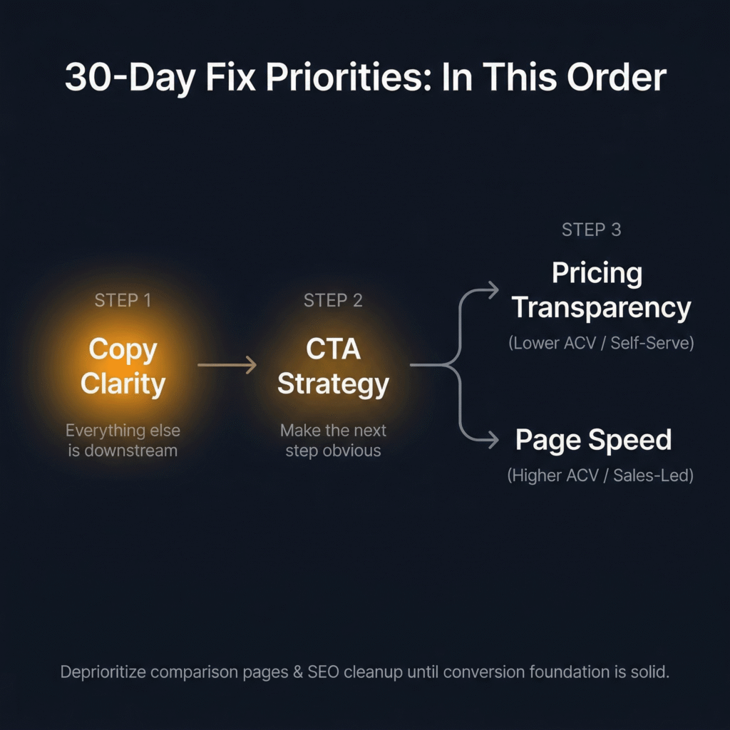
First Priority: Copy Clarity
“Everything else is downstream of whether the visitor understands what you do, who it’s for, and what problem it solves,” Saunders says. “A fast page with a confusing hero is still a leaking page.”
Start with the hero — apply the five-second test and the outcomes-first formula from Section 4. Then audit the next layer of messaging: subheadings, product descriptions, feature explanations. Are they written in the buyer’s language or the product team’s language? Do they lead with outcomes or with features? Can a visitor who’s never heard of your company follow the logic of the page from top to bottom without getting lost?
One important caveat from Saunders: “If your copy is already in good shape, less work is needed here — the audit tells you how much effort this deserves.” Not every company has a copy problem. But most growth-stage companies do, because the copy was written by the people closest to the product — which means it almost always leans too far toward internal language and feature descriptions. The audit confirms whether this is your bottleneck, and if it is, it should be the first thing you fix. Everything else we’ve discussed in this article — CTA performance, trust signal effectiveness, pricing communication, even SEO — works better when the foundational messaging is clear.
Second Priority: CTA Strategy
Clear messaging fails if the next step isn’t obvious or asks too much too soon. Once the copy is doing its job — once the visitor understands the value — the CTA needs to match that momentum with a single, clear, low-friction action.
This means consolidating competing CTAs so every element on the page points toward one primary action. It means fixing placement so the primary CTA is visible above the fold, not buried beneath three sections of content. And it means reducing friction at the action point — removing unnecessary form fields, adding friction-removers, and making sure the post-click experience (confirmation page, next-step instructions, response time) doesn’t break the trust the pre-click experience just built.
“Consolidating competing CTAs, fixing placement, and reducing friction at the action point are typically quick wins with immediate conversion impact,” Saunders says. This is one of the few website fixes where you can often see results within days, not weeks — which makes it especially valuable in a 30-day window where you need to demonstrate progress quickly.
Third Priority: Page Speed or Pricing Transparency — Pick Based on Your Model
The third fix depends on your business. Saunders breaks it into two paths:
“If you’re lower ACV or self-serve, prioritize pricing transparency,” he says. “Buyers at that tier expect clarity and will go to a competitor who provides it.” For these products, pricing discoverability is a direct conversion lever. Making pricing visible from the homepage and main navigation, showing tier value alongside tier price, and removing any “Contact Us” barriers that don’t serve a genuine deal-complexity purpose — these changes reduce one of the most common friction points for self-serve buyers.
“If you’re higher ACV or sales-led, prioritize page speed,” Saunders says. “Pricing opacity is more justifiable at that tier, but slow pages are a universal conversion tax that affects everyone regardless of deal size.” For these products, page speed also has the added benefit of improving SEO simultaneously — which sets up the SEO sequence we’ll cover in the next section.
What to Deprioritize in a 30-Day Sprint
Just as important as knowing what to do first is knowing what to set aside — not because it doesn’t matter, but because the timing isn’t right.
“Deprioritize comparison pages and broader SEO cleanup in a 30-day sprint,” Saunders says. “Not because they don’t matter, but because the logic is simple: get your conversion rate to its best possible level before driving more traffic to the page. There’s no point optimizing for more visitors if the page isn’t ready to convert them.”
This is the principle that separates a productive 30-day sprint from a scattered one. Traffic amplifies whatever the website is already doing. If the site builds trust effectively, more traffic means more conversion. If the site leaks trust, more traffic just means more waste. Fix the foundation first. Then turn up the volume.
The Right SEO Sequence Once Your Conversion Foundation Is Solid
SEO is one of those topics where growth-stage teams tend to fall into one of two traps. Either they ignore it entirely — treating it as a slow-burn channel that won’t matter for months — or they chase it too early, pouring resources into content production and keyword targeting before the website can convert the traffic those efforts would generate. Both approaches waste time and money. The right move is to treat SEO as a compounding investment that starts after the conversion foundation is in place — and to sequence the work so each phase builds on the last.
“The sequencing matters as much as the fixes themselves,” Saunders says. “Do things in the wrong order and you’re building on an unstable foundation.”
First: Technical Fixes, Using Data to Find Them
The starting point isn’t a keyword strategy or a content calendar. It’s the technical infrastructure that determines whether search engines can properly read, index, and rank your pages in the first place.
“Don’t guess what’s broken,” Saunders says. “Google Search Console and Core Web Vitals reports are free, accessible, and will tell you exactly where the technical gaps are before you spend a penny fixing anything.”
The most common culprit is page speed — particularly on mobile, where most traffic arrives and where performance gaps are most severe. As we covered in Section 2, Portent’s research shows that B2B sites loading in one second convert at 3x the rate of sites loading in five seconds. But page speed isn’t just a conversion issue — it’s a ranking issue. Google has used page speed as a ranking factor since 2018, and Core Web Vitals became a formal ranking signal in 2021. A slow site doesn’t just lose visitors after they arrive. It loses visibility before they arrive, because search engines deprioritize it in results. Fixing technical performance addresses both problems simultaneously, which is why it belongs at the front of the SEO sequence rather than somewhere in the middle.
Beyond speed, the technical audit should cover crawlability (can Google actually find and index your key pages?), mobile responsiveness (does the site render properly on the devices most visitors use?), and structural issues like broken links, missing meta tags, and duplicate content. None of this is glamorous work. But skipping it is like writing a brilliant headline on a billboard that faces the wrong direction — the content might be great, but nobody’s seeing it.
Second: Rewrite Product and Category Pages Around Search Language Buyers Actually Use
This is where SEO and conversion start reinforcing each other directly. Most growth-stage websites describe their product using internal language — the terminology the team uses in Slack, in product specs, in board decks. The problem is that buyers don’t search for your internal language. They search for their own.
“Google Search Console shows you exactly what terms people are already using to find your site — that’s your starting point,” Saunders says. “Rewriting product and service pages around real search behavior produces both SEO and conversion impact simultaneously, making it one of the highest ROI fixes available.”
This is worth underscoring because it challenges a common assumption. Many teams think of SEO copy and conversion copy as separate workstreams — one optimized for search engines, the other for human readers. In practice, they’re the same thing when done well. The language buyers use in search queries is the language that resonates with them on the page, because it’s the language that describes their problem in their own words. A product page rewritten around real search behavior doesn’t just rank better. It reads better — because it speaks to the buyer’s frame of reference instead of the company’s.
The practical process is straightforward. Pull your Search Console data. Look at the queries already driving impressions and clicks to your key pages. Identify the gaps between the language you’re using on those pages and the language buyers are using to find them. Then rewrite — not for keyword density, not for search engine tricks, but for alignment between what the buyer is looking for and what the page actually says.
Third: Build New Landing Pages Based on Real Search Demand
Once the technical foundation is sound and your core pages are aligned with real search behavior, the third phase is expansion — creating targeted landing pages for specific use cases, industries, or high-intent search terms where volume justifies the effort.
“A page targeting ‘HR software for healthcare companies’ will likely outperform a generic HR software page for that visitor every time,” Saunders says. “The key is specificity matched to real demand, not speculative content creation.”
This distinction matters. The temptation for growth-stage teams with limited resources is to produce content at volume — publish twenty blog posts, target fifty keywords, build a dozen landing pages — hoping that some of it sticks. That approach burns resources on speculative bets without a clear return framework. The better approach is to let search data guide the investment. Where are buyers already searching for solutions that look like yours? Which queries have enough volume to justify a dedicated page? Which are high-intent enough that a visitor arriving from that query is likely to convert?
Build pages for those queries specifically — one use case, one industry, one problem per page — and connect them to the conversion infrastructure you’ve already strengthened in the first 30 days. The specificity of the page matches the specificity of the search intent, which means the visitor arrives on a page that feels like it was built for them. That alignment between search intent and page content is what drives both ranking and conversion — and it’s what turns SEO from a slow-burn traffic channel into a compounding growth engine.
Why This Sequence Compounds
The reason this order works isn’t just that each phase depends on the one before it. It’s that each phase amplifies the one before it. Technical fixes make your existing pages visible. Copy rewrites make those visible pages convert. New landing pages extend that conversion capability to search queries you weren’t capturing before. And every page that converts well sends positive engagement signals back to search engines — lower bounce rates, longer time on site, higher interaction rates — which improves rankings, which drives more traffic, which converts because the page was built for it.
That’s the compounding loop. It doesn’t start with content volume. It starts with a foundation that converts — and then scales from there.
How to Measure Whether Trust Actually Improved
Fixing trust leaks is only half the job. The other half is proving the fixes worked — not with gut feelings or anecdotal praise from the sales team, but with metrics that connect website changes to business outcomes in a sequence your leadership team and investors can follow.
This is where many growth-stage teams lose the thread. They ship the changes, watch a dashboard for a few days, and either declare victory prematurely or lose confidence when the numbers don’t move fast enough. Both reactions come from the same mistake: treating all metrics as if they operate on the same timeline. They don’t. Different signals appear at different speeds — and knowing which to watch first, second, and third is what separates a rigorous measurement framework from a nervous glance at Google Analytics.
Saunders splits post-fix measurement into three tiers based on how quickly signal appears.
Early Signals: Days, Not Weeks
Conversion rate to the desired action. This is your first checkpoint after any fix goes live, and it should be the metric you watch most closely in the first one to two weeks. Did the percentage of visitors completing your primary action — demo request, free trial signup, contact form submission — move? If you fixed hero copy and CTA strategy, this is where you’ll see the signal first. Movement here can show up within days.
Funnel-step conversion tied to the specific fix. Alongside overall CVR, track the individual conversion step you changed. “If a specific fix was made at a specific funnel stage, that’s where you’ll see the signal quickest and most cleanly,” Saunders says. If you consolidated CTAs above the fold, measure click-through rate on that specific CTA — not just aggregate page conversion. If you shortened a demo request form, measure form completion rate specifically. Isolating the metric to the fix gives you a clean signal and protects against misattribution.
A note on CAC. “Website conversion sits at the heart of your acquisition funnel,” Saunders says. “CVR improvement is the leading indicator. CAC reduction follows as the compounding effect builds.” This is important framing for anyone who needs to report results to leadership quickly. Don’t wait for CAC to move before you validate a website fix. Track CVR first — that’s your leading indicator. CAC reduction is the downstream confirmation, and payback period improvement is the longest-term validator, requiring sustained revenue data to be meaningful. “Don’t wait for ROAS movement to validate a website fix,” Saunders says. “Track CVR first, then watch the commercial metrics follow downstream in sequence.”
Medium-Term Signals: Weeks, Not Months
Lead quality and funnel progression. For sales-led products, sales team feedback can be a useful early proxy — are prospects arriving better informed, with stronger intent, asking sharper questions? That qualitative signal matters, especially in the first 30–60 days when quantitative samples may still be small.
But Saunders is careful to note that lead quality measurement depends on your model. “Many growth-stage companies are self-serve, in which case lead quality is better measured through funnel progression and activation rates than through sales conversations,” he says. For self-serve products, the question isn’t whether leads are “better qualified” in the traditional sales sense. It’s whether users who sign up after your fixes are progressing further through the product — activating features, completing onboarding, reaching the moment of value — at higher rates than before. That progression data is your quality signal.
Organic search visits. As the SEO fixes from Section 10 begin to take hold, organic traffic should start climbing — but expect this to lag behind CVR movement. “Visits from organic search reflect whether SEO and content fixes are gaining traction,” Saunders says. “Expect this to take longer than CVR — weeks rather than days — but it’s a cleaner signal of whether the site is building sustained visibility.” The keyword here is sustained. A spike in organic traffic after a page rewrite might reflect a temporary ranking bump. Steady, upward movement over four to eight weeks reflects genuine search authority building — and that’s the signal you want.
Longer-Term Signals: Months, Not Weeks
Return visits. When visitors come back without being retargeted or emailed, it means the site built enough trust to stay on their consideration list. That’s a meaningful credibility signal — but not a fast one. “Worth tracking, but don’t expect quick movement,” Saunders says. “This is a longer-term indicator of credibility building rather than an early fix validation metric.” Return visit rates are most useful as a trend line over 60–90 days. A steady increase suggests the site is earning mindshare. A flat line suggests the fixes improved first-visit conversion without meaningfully changing how visitors perceive the company long-term — which is still a win, but a different kind of win.
Branded search lift. An increase in people searching for your company by name is a strong indicator that overall brand credibility is growing. More people are hearing about you, remembering you, and coming back to find you directly. Saunders flags this as useful but limited in attribution value. “Too laggy and too difficult to attribute directly to specific website fixes to be a primary metric,” he says. “Treat it as a long-term health check rather than a fix validation tool.” Branded search lift is influenced by too many factors — PR, word of mouth, content marketing, event presence, ad impressions — to isolate the impact of a website change with any confidence. But if branded search rises steadily in the months following a trust-focused website overhaul, it’s a confirming signal that the broader credibility strategy is working.
The Measurement Sequence, Simplified
Think of it as a cascade. CVR moves first. Lead quality and funnel progression follow. CAC starts to shift. Organic traffic builds. Return visits tick up. Branded search grows. Each metric operates on its own timeline, and each validates a different layer of the trust improvements you made. Trying to measure them all on the same clock — or worse, waiting for the lagging indicators before validating the leading ones — is the fastest way to lose confidence in work that’s actually producing results.
The practical move is to set up your measurement before you ship the fixes, not after. Define which metric maps to which change. Set a realistic timeline for when you expect signal to appear. And then watch the leading indicators first, the mid-range indicators second, and the lagging indicators third — in that order, with appropriate patience at each stage.
A Practical 90-Day Plan for Fixing Website Trust
Everything we’ve covered so far — the diagnostic framework, the trust leaks, the hero copy formula, the trust signal hierarchy, the gating and pricing decisions, the SEO sequence, the measurement model — is designed to be useful on its own. But it’s most powerful when you sequence it into a structured plan with clear phases, clear priorities, and clear milestones. Here’s how we’d lay out 90 days of trust-focused website work if we were starting tomorrow.
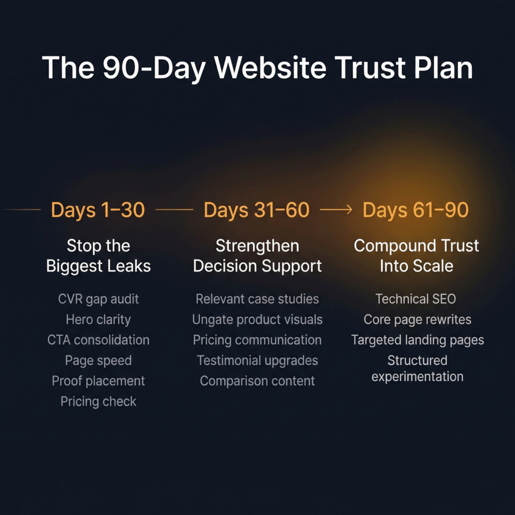
Days 1–30: Stop the Biggest Trust Leaks
This is the foundation phase. The goal isn’t perfection — it’s stopping the active bleeding so the site converts at its best possible baseline before you drive more traffic to it.
- Audit the CVR gap. Pull your conversion rate to the primary action and compare it against category benchmarks. Check whether CVR shifted as traffic mix changed to rule out traffic quality as the root cause.
- Fix hero clarity. Run the five-second test on mobile and desktop. Rewrite using the outcomes-first formula: outcome headline, one-line mechanism, single CTA, friction-remover. If your headline could fit on a competitor’s site without changing a word, it needs to be rewritten.
- Consolidate CTA strategy. Identify every CTA on your highest-traffic pages. Reduce to one primary action above the fold. Remove or deprioritize competing asks. Ensure the primary CTA is consistent across the page — banner, hero, and mid-page CTAs should all point the same direction.
- Address page speed. Run Google Search Console and Core Web Vitals reports. Identify the worst offenders — particularly on mobile. Fix the most impactful issues first (image compression, server response time, render-blocking scripts).
- Move social proof up. Audit where your logos, case studies, and testimonials sit on the page. Move the most relevant proof closer to the hero — not above it, but immediately supporting it. If you serve multiple industries, consider selectors that let visitors see proof from their own sector.
- Check pricing discoverability. If you’re lower ACV or self-serve, make sure pricing is accessible from the homepage and main navigation with no more than one click. If you’re higher ACV, confirm that the absence of visible pricing is a deliberate, defensible choice — not an oversight.
By day 30, you should see early CVR movement on the pages you changed. If you set up measurement before shipping (as outlined in Section 11), you’ll have clean data on which fixes produced signal and which need further iteration.
Days 31–60: Strengthen Decision Support
With the biggest leaks patched, the second phase shifts from removing friction to adding conviction. The goal is to give visitors more reasons to believe — and fewer reasons to hesitate — at every decision point on the site.
- Add relevant proof. Build or surface case studies that match your highest-value visitor segments by industry and problem type. If you don’t have enough case studies yet, start with specific testimonials — short quotes from customers in relevant contexts describing concrete outcomes.
- Ungate product visuals. Audit what you’re currently gating and pressure-test each gate against the friction-cost framework from Section 6. Product screenshots, walkthrough videos, and workflow demos should be ungated unless they involve live customer data. If a gate is necessary, reduce it to email-only and add a friction-remover directly beneath the form.
- Strengthen pricing communication. If you have a pricing page, add tier value articulation — not just what each tier includes, but why the step-up matters. If you have a competitive pricing advantage, surface it prominently. If you don’t have a pricing page and your model supports one, this is the phase to build it.
- Improve testimonials. Replace generic praise with specific, outcome-oriented quotes. Prioritize relevance to your highest-traffic visitor segments. Where possible, pair testimonials with quantified results — but only when the numbers are grounded and attributable.
- Build comparison content where appropriate. If your category is established enough and your differentiation is stable, create a comparison page that leads with genuine strengths and acknowledges fit honestly. If a formal comparison page doesn’t make sense yet, invest in managing your presence on third-party comparison channels — G2, Capterra, Reddit, and industry communities where buyers are already forming opinions.
By day 60, you should see continued CVR improvement alongside early signals on lead quality and funnel progression. Sales teams (for sales-led products) should start reporting better-informed prospects. Self-serve products should see improved activation rates from visitors who signed up after the changes.
Days 61–90: Compound Trust Into Scale
The final phase is where trust improvements start generating their own momentum. The conversion foundation is solid. The decision-support layer is in place. Now you extend the reach of both by driving more — and better — traffic to pages that are ready to convert it.
- Address technical SEO. Complete the technical audit you started in phase one. Fix remaining crawlability issues, resolve duplicate content, add missing meta tags, and ensure mobile responsiveness is clean across all key pages.
- Rewrite core pages around search behavior. Pull Search Console data on the queries driving impressions and clicks to your product and category pages. Identify gaps between your current language and the language buyers actually use. Rewrite to align — not for keyword stuffing, but for genuine resonance between search intent and page content.
- Launch targeted landing pages. Build specific pages for your highest-volume, highest-intent search queries — segmented by use case, industry, or problem type. Each page should connect directly to the conversion infrastructure you built in phases one and two: clear hero, single CTA, relevant proof, friction-remover.
- Start structured experimentation. With clean measurement in place and a strong baseline established, begin A/B testing key elements — headline variations, CTA copy, proof placement, form length — to compound gains. Use the early-signal metrics from Section 11 (CVR to desired action, funnel-step conversion) to evaluate tests quickly and iterate without waiting for lagging indicators.
By day 90, you should have a website that converts meaningfully better than it did on day one — with clean data proving it. Organic search visits should be trending upward. CAC should be showing early signs of improvement as the CVR gains compound through the acquisition funnel. And you should have a measurement framework and experimentation cadence in place that turns trust-building from a one-time project into an ongoing growth capability.
Trust Compounds. Friction Compounds Too.
We started this article with a story about eight steps. A consumer product journey that had grown, one reasonable decision at a time, into something that asked users to prove their patience before they’d seen a moment of value. No single step was the problem. The accumulation was.
The same principle applies to every growth-stage website we’ve ever audited. The trust leaks are rarely dramatic. They don’t announce themselves. A slightly unclear headline. A form with three extra fields. Pricing that’s one click too far away. Proof that’s in the wrong order on the page. A page that loads two seconds slower than it should. Each one is small enough to ignore — and together, they’re large enough to suppress conversion across every channel feeding the site.
But the good news is that the fix compounds just as fast as the friction does. Clear messaging makes CTAs more effective. Better CTAs make trust signals more impactful. Stronger proof makes pricing conversations easier. Faster pages make everything else on the page more likely to be seen. Each fix amplifies the one before it — and together, they don’t just improve a metric. They change how buyers experience your company from the first second they arrive.
Every step in a journey is a decision point. What you put in front of someone at that moment either builds their confidence or erodes it. The website is where that principle becomes visible fastest — and where fixing it produces the clearest, fastest return.

Your One-Week Starting Point
If you read this article and recognized your own website in three or more of the trust leaks we described, here’s your next step: pick the one that’s closest to the top of the diagnostic sequence — hero clarity, CTA consistency, page speed, or proof placement — and fix it this week. One change. One page. One week. See what moves.
And if you want a team that’s done this across 70+ growth-stage companies — one that embeds directly into your business, runs the full diagnostic, and executes the 90-day plan alongside you — book a growth audit with MAVAN. We’ll show you exactly where trust is leaking, which fixes move the numbers fastest, and how to build the kind of website that converts demand instead of wasting it.
Frequently Asked Questions About Website Conversion and Trust Leaks
How do I know if my website has a trust problem or a traffic problem?
Pull your conversion rate to your primary action (demo request, free trial, contact form) and compare it to category benchmarks. If you’re consistently underperforming across multiple traffic sources — paid, organic, direct, referral — the site itself is the bottleneck. If CVR dropped when you scaled a specific channel, it may be a traffic quality issue instead. The distinction matters because the fix for each is completely different.
What’s the fastest website fix that actually moves conversion?
Copy clarity and CTA consolidation tend to produce the fastest measurable lift. If your hero section fails the five-second test — can a first-time visitor understand what you do and who it’s for without scrolling? — rewriting it using the outcomes-first formula (outcome headline, one-line mechanism, single CTA, friction-remover) can show CVR movement within days. Consolidating competing CTAs into one clear above-the-fold action is often just as fast.
Should I show pricing on my website?
It depends on your model. For lower-ACV and self-serve products, yes — buyers at that tier expect transparency and will choose a competitor who provides it over one who hides behind “Contact Us.” For higher-ACV, genuinely bespoke deals where pricing varies significantly by deployment or contract terms, keeping pricing off-site is defensible. The key question is whether the opacity is driven by real deal complexity or by internal indecision — buyers can tell the difference.
When should I gate content, and when should I ungate it?
Gate only what genuinely requires a secure environment — like demos involving live customer data or trials that provision real accounts. Product tours, screenshots, walkthrough videos, and case studies should be ungated, because these are trust-building assets and putting a form in front of them interrupts the buyer’s decision process at exactly the wrong moment. When a gate is necessary, keep it to email only and add a friction-remover (“No credit card · Live in 5 minutes”) directly beneath the form.
Do customer logos actually help conversion?
Less than most teams think. Logo walls only build trust if the visitor recognizes the names — a grid of unknown logos does little. More importantly, sequencing matters. Logos placed before the company has established what it does and why it matters are wasted. Relevant case studies, product visuals, and specific testimonials consistently outperform logos in driving conversion. If you use logos, earn the right to show them by establishing your value proposition first.
What should I prioritize in a 30-day website sprint?
Fix copy clarity first — everything else is downstream of whether the visitor understands your value. CTA strategy second — clear messaging fails if the next step isn’t obvious. Third, choose based on your model: pricing transparency for lower-ACV or self-serve products, page speed for higher-ACV or sales-led products. Deprioritize comparison pages and broader SEO cleanup until the site converts well — there’s no point driving more traffic to a page that still leaks trust.
How long before I see results from website trust fixes?
CVR to your primary action can move within days of a fix going live — that’s your leading indicator. Lead quality improvements and funnel progression typically show up over weeks. CAC reduction follows as the compounding effect builds over one to two months. Organic search gains from SEO work take the longest — expect weeks to months. The mistake most teams make is waiting for lagging indicators like CAC or branded search lift before validating work that’s already producing signal at the CVR level.
What’s the right SEO sequence for a growth-stage company?
Technical fixes first — use Google Search Console and Core Web Vitals to find real issues, especially page speed on mobile. Second, rewrite product and category pages around the search language buyers actually use (Search Console shows you what terms people already type to find you). Third, build targeted landing pages for specific use cases, industries, or high-intent queries where search volume justifies it. This order matters because each phase builds on the last — and because there’s no point optimizing for more traffic until the site can convert it.
How do I write a comparison page that doesn’t look defensive?
Lead with your genuine strengths for a specific buyer profile rather than claiming to be better at everything. Buyers spot a rigged comparison immediately — a feature grid where you get green checkmarks on every row and the competitor gets red Xs undermines the trust the page is supposed to build. Be intellectually honest about where you’re the stronger fit and where you’re not. That confidence is counterintuitively one of the strongest trust signals a growth-stage company can deploy.
What’s the difference between trust signals that move conversion and ones that are cosmetic?
Relevance is the dividing line. A case study from a mid-size company in the visitor’s sector will outperform a Fortune 500 logo from an unrelated industry. A two-line testimonial describing a specific problem solved carries more weight than a paragraph of generic praise. Quantified outcomes work only when attributed and verifiable. Security badges are table stakes in regulated industries and nearly invisible in others. The principle: proof only works after the visitor understands what you do — trust signals amplify a clear message, they can’t replace a confusing one.
Book a complimentary consultation with one of our experts
to learn how MAVAN can help your business grow.
Want more growth insights?
Thank you! form is submitted
[hubspot type=”form” portal=”20951211″ id=”9c538ed2-fb12-45f1-a573-ad7953c058cc”]
Related Content
-

Website Conversion Is a Trust Problem: SEO, UX, Messaging Fixes Growth-Stage Teams Can Make in 90 Days
TLDR — 10 Trust Fixes That Move Website Conversion The Friction You Can’t See Eight steps. That’s how many it took for a new user to go from landing on a consumer product’s website to actually using the thing they came for. MAVAN Growth Lead Matt Saunders worked on that funnel — and when he…
-

Acquisition Architecture That Scales: A Practical Performance Marketing Framework for Venture-Backed Teams
TLDR — 10 Growth Takeaways for Acquisition Architecture When Rising CAC Isn’t Just a Paid Media Problem It’s not uncommon for people to treat acquisition like a media problem. You might swap channels, raise bids, or cut creative. And since you’re taking action, it can feel like you’re accomplishing something. But as Sam McLellan, MAVAN’s…
-
The Board-Ready Scoreboard: The 12 Metrics That End Arguments
TLDR — 10 Takeaways For Returning Decision-Making to Board Meetings When board meetings go wrong You walk into the board meeting with hope. The soft launch looks stable and the gates you set look good. You get the green light to go global and the board wants you to ship it immediately. It’s understandable because…